In the fast-paced SaaS industry, even minor tweaks can make a big difference.
A/B testing helps you identify which changes boost engagement, increase sign-ups, and elevate revenue.
New to A/B testing or seeking fresh ideas?
I’ve handpicked 24 powerful strategies for fine-tuning your SaaS platform.
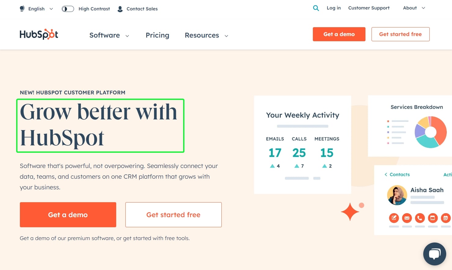
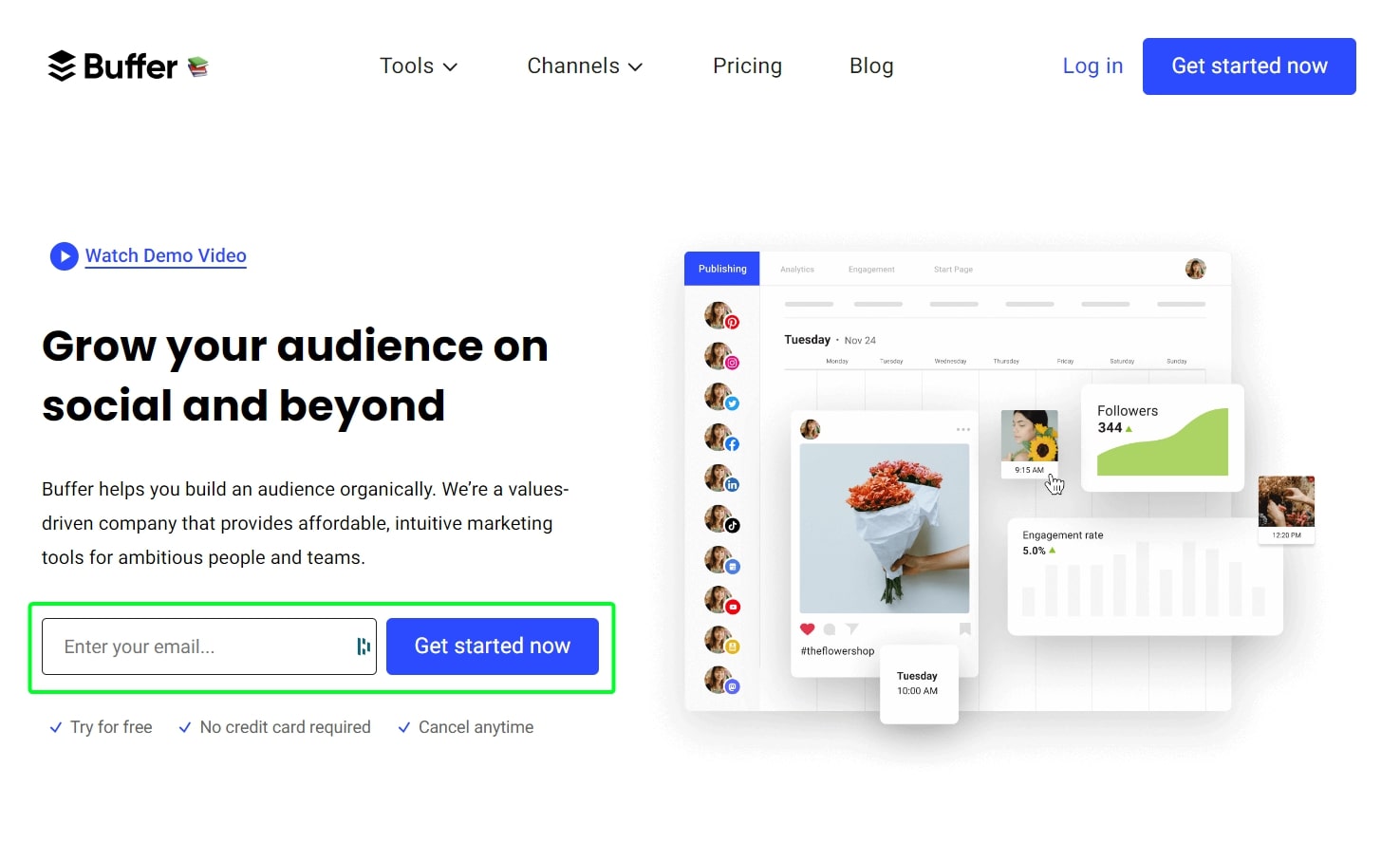
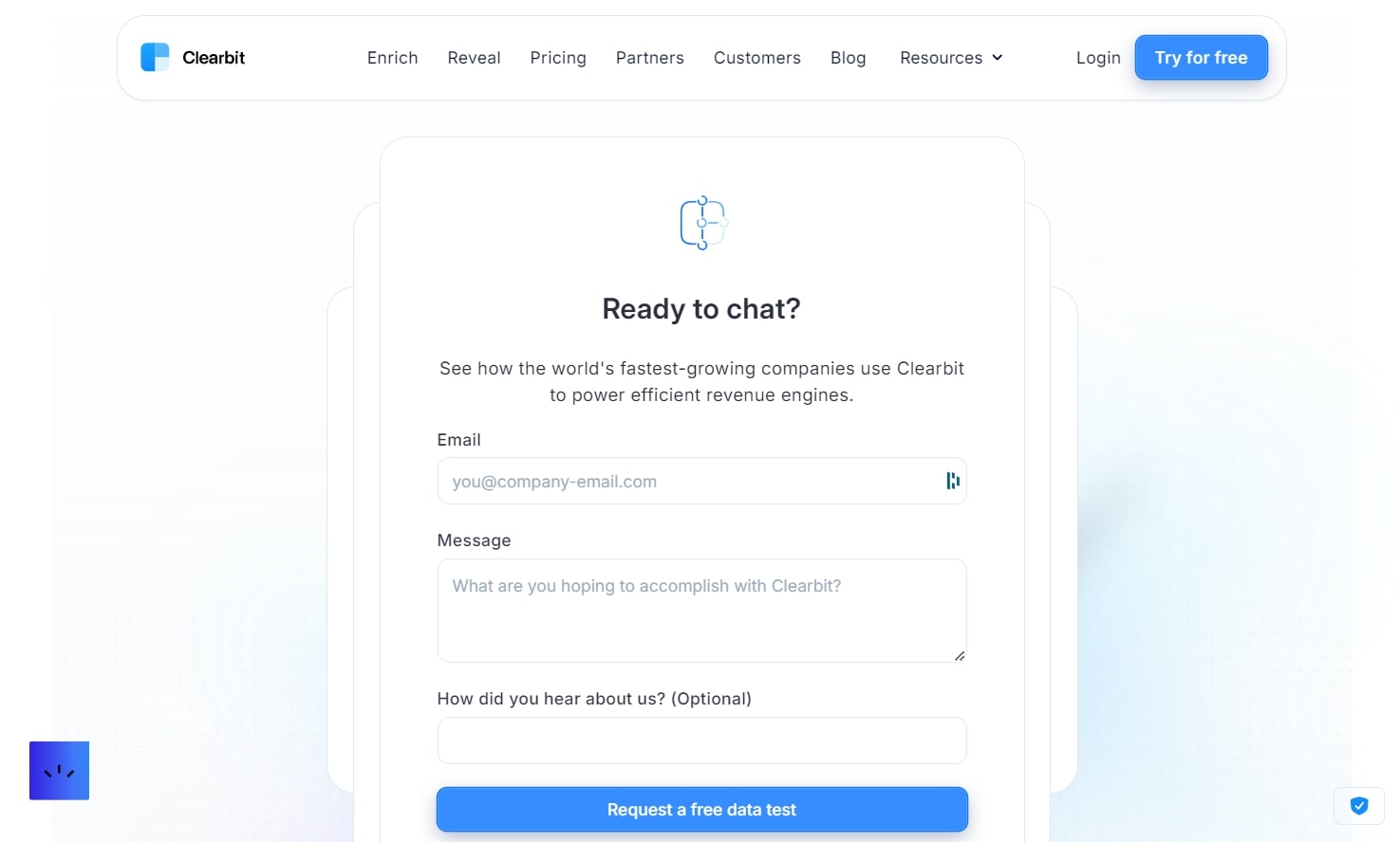
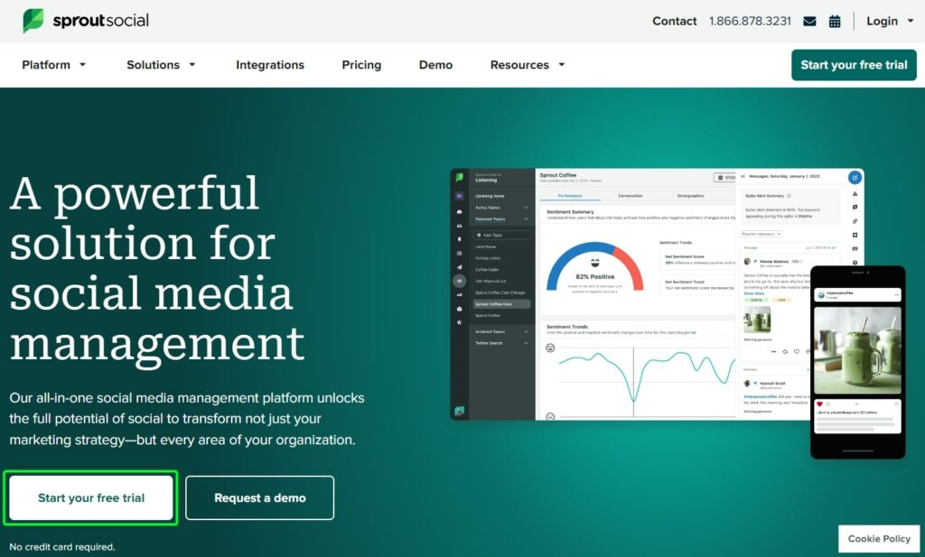
1. A/B Test a Benefit-driven Headline
- A – Use a benefit-driven headline
- B – Use a feature-driven headline
Objective: Determine which headline type, benefit-driven vs. feature-driven, results in higher engagement and conversion rates for visitors landing on the SaaS website.
Hypothesis: The benefit-driven headline will resonate more with visitors and lead to a higher conversion rate than the feature-driven headline.
Metrics to track: Number of clicks on your “Start free trial” or “Book a demo” button.
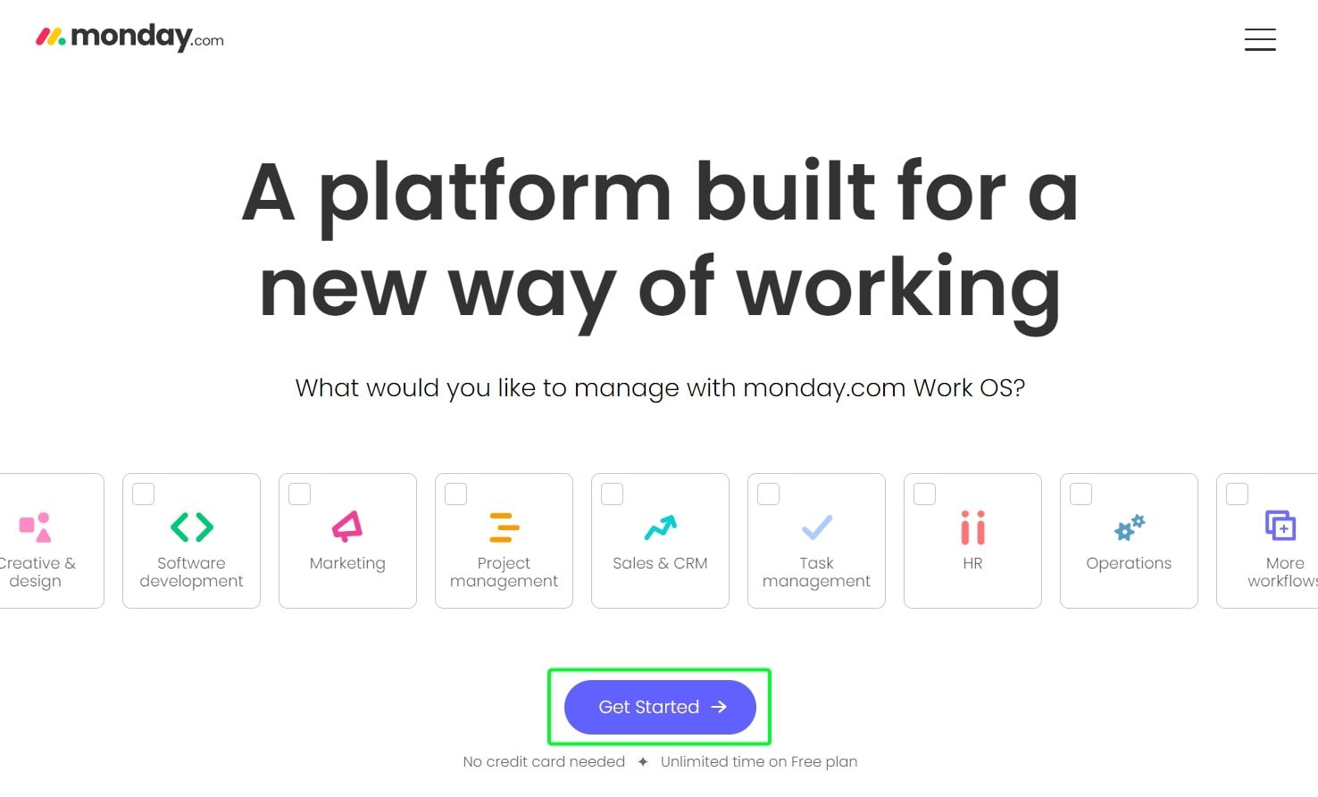
2. A/B Test an Action-Based CTA
- A – Use an action-based CTA: “Get Started Now”.
- B – Use a value proposition CTA: “Unlock Better Workflows”.
Objective: Determine which CTA style, action-based vs. value proposition, drives more clicks and user engagement on the website.
Hypothesis: The action-based CTA “Get Started Now” will compel more users to click compared to the value proposition CTA “Unlock Better Workflows”.
Metrics to track: Number of clicks on the respective CTA button.
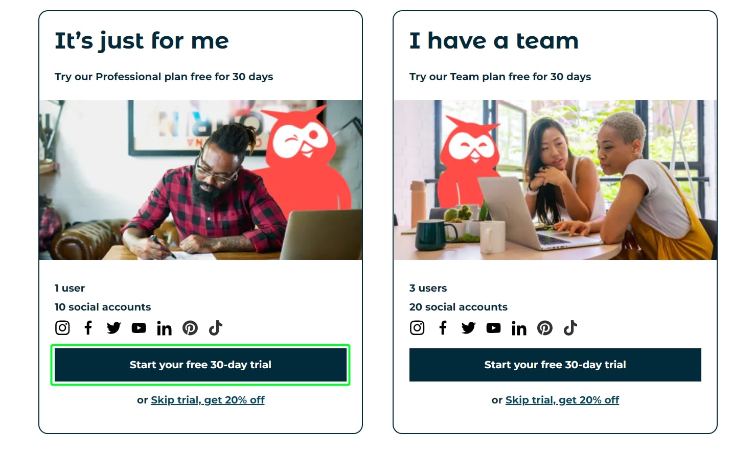
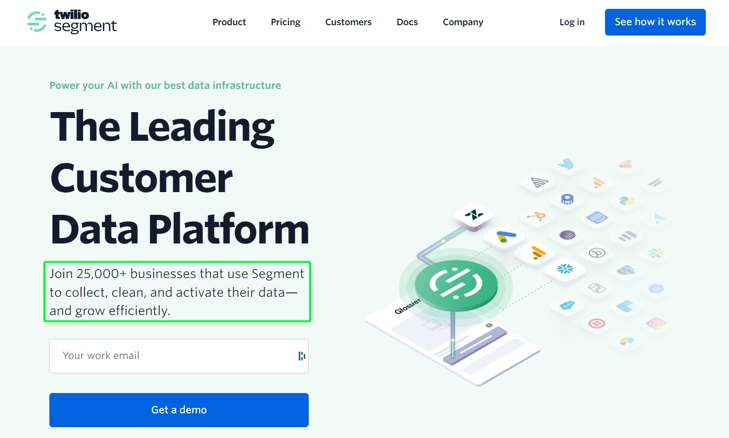
3. A/B Test Signup Incentive Strategy
- A – Offer a 14-day free trial without requiring a credit card.
- B – Offer a 30-day free trial but require a credit card upfront.
Objective: Determine which signup incentive, a 14-day free trial without a credit card vs. a 30-day free trial with a credit card upfront, results in a higher number of paid customers after the trial period ends.
Hypothesis: Offering a 30-day free trial with a credit card requirement upfront will lead to a higher conversion of trial users to paid customers compared to the 14-day free trial without a credit card.
Metrics to track: Number of users converting to paid customers after each respective trial period.
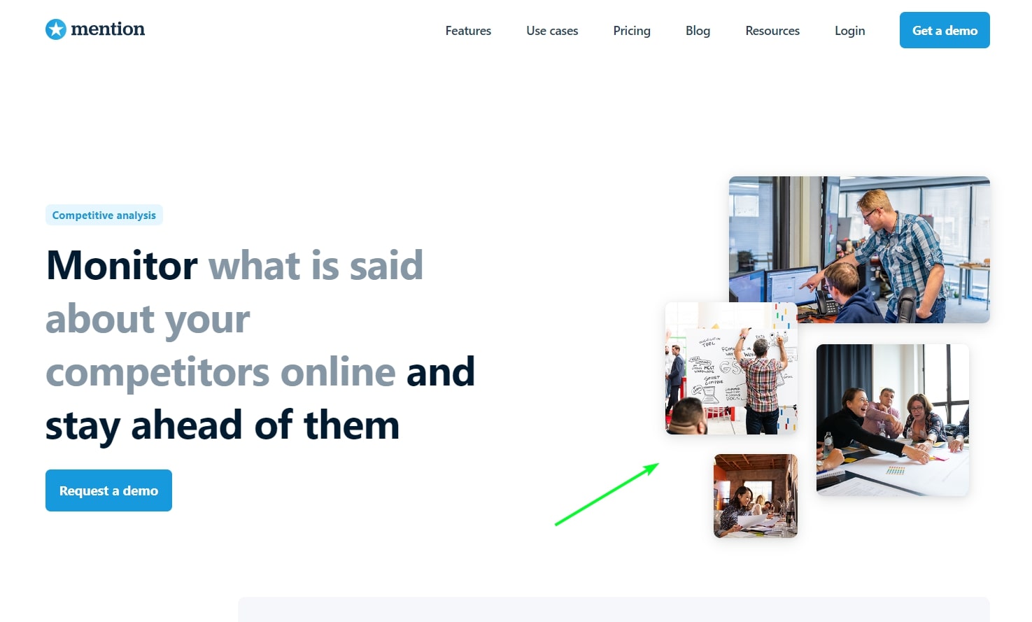
4. A/B Test Homepage Hero Media
- A – Use a static hero image as the main visual.
- B – Use a hero video as the main visual.
Objective: Determine which homepage hero media, static image vs. video, engages visitors more effectively and leads to better conversion rates.
Hypothesis: The homepage hero video will capture visitors’ attention more effectively and lead to a higher engagement and conversion rate than the static hero image.
Metrics to track: Number of users engaging with the primary CTA on the homepage (e.g., “Start free trial”, “Learn More”, or “Book a demo”).

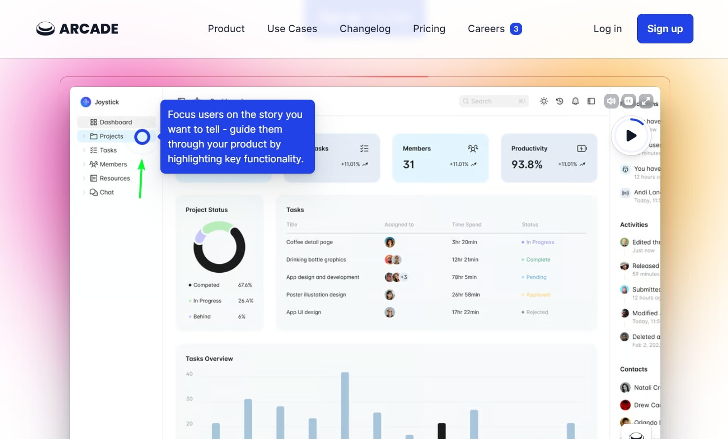
5. A/B Test Homepage Hero Product Demo
- A – Use a static hero image as the main visual.
- B – Use a product demo as the main visual.
Objective: Determine which homepage hero media, static image vs. product tour, engages visitors more effectively and leads to better conversion rates.
Hypothesis: The homepage hero product demo will captivate visitors more effectively and result in higher engagement and conversion rates compared to the static hero image.
Metrics to track: Number of users engaging with the primary CTA on the homepage (e.g., “Start free trial”, “Learn More”, or “Book a demo”).
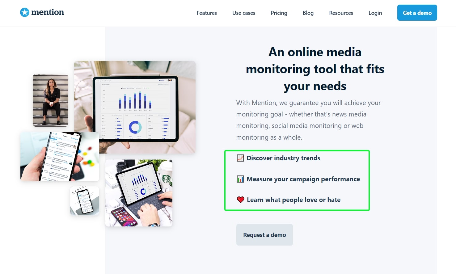
6. A/B Test Website Imagery Choice
- A – Use illustrations as the main visual elements.
- B – Use stock images as the main visual elements.
Objective: Determine which type of visual, illustrations vs. stock images, engages visitors more effectively and enhances user experience on the website.
Hypothesis: Stock images will provide a more relatable and authentic feel, leading to better engagement and user experience compared to illustrations.
Metrics to track: Number of users engaging with the primary CTA on the relevant pages (e.g., “Start free trial”, “Learn More”, or “Book a demo”).
7. A/B Test Content Length on Features Page
- A – Provide detailed descriptions and use cases for each feature.
- B – Use concise bullet points and rely on visuals to communicate the value.
Objective: Determine which content presentation, detailed descriptions vs. concise bullet points with visuals, is more effective in conveying the value of features to visitors and leads to better engagement.
Hypothesis: Concise bullet points paired with visuals will lead to higher user engagement and understanding than detailed descriptions and use cases.
Metrics to track: Number of users engaging with a relevant CTA on the features page (e.g., “See a demo”, “Get started”, or “Learn more about [specific feature]”).
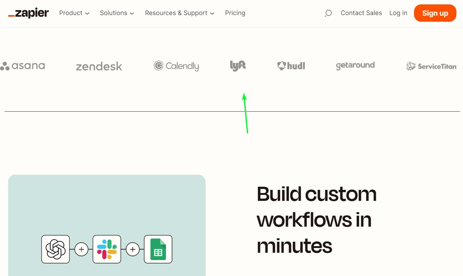
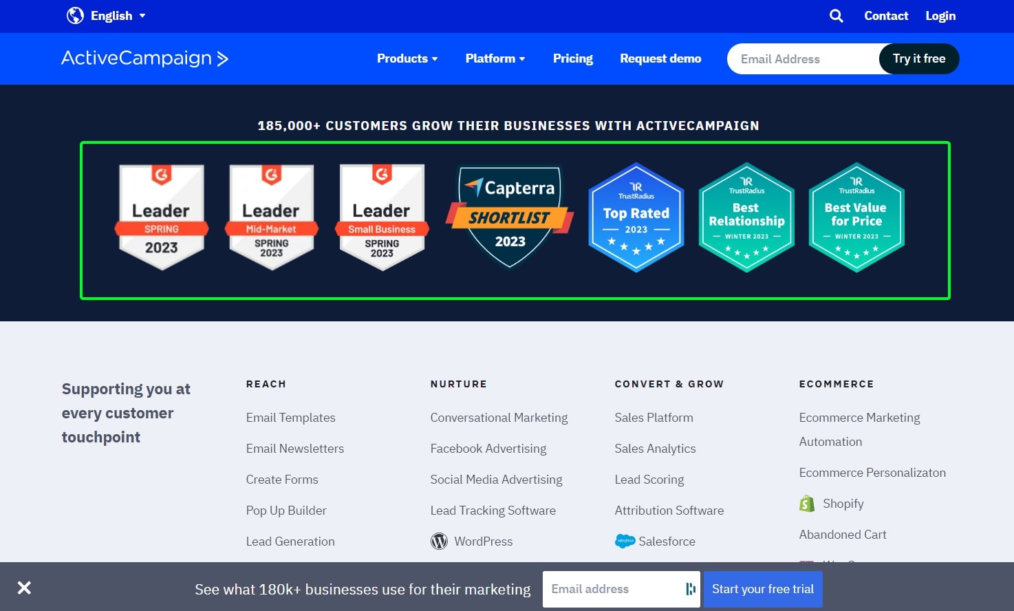
8. A/B Test Social Proof Presentation
- A – Display the logos of big-name clients.
- B – Show the number of active users or companies using the software.
Objective: Determine which form of social proof, big-name client logos vs. number of active users/companies, builds more trust and results in higher conversion rates for visitors on the website.
Hypothesis: Displaying the logos of big-name clients will resonate more with visitors and lead to a higher conversion rate than showing the number of active users or companies.
Metrics to track: Number of users engaging with the primary CTA on the website (e.g., “Start free trial”, “Learn More”, or “Book a demo”).
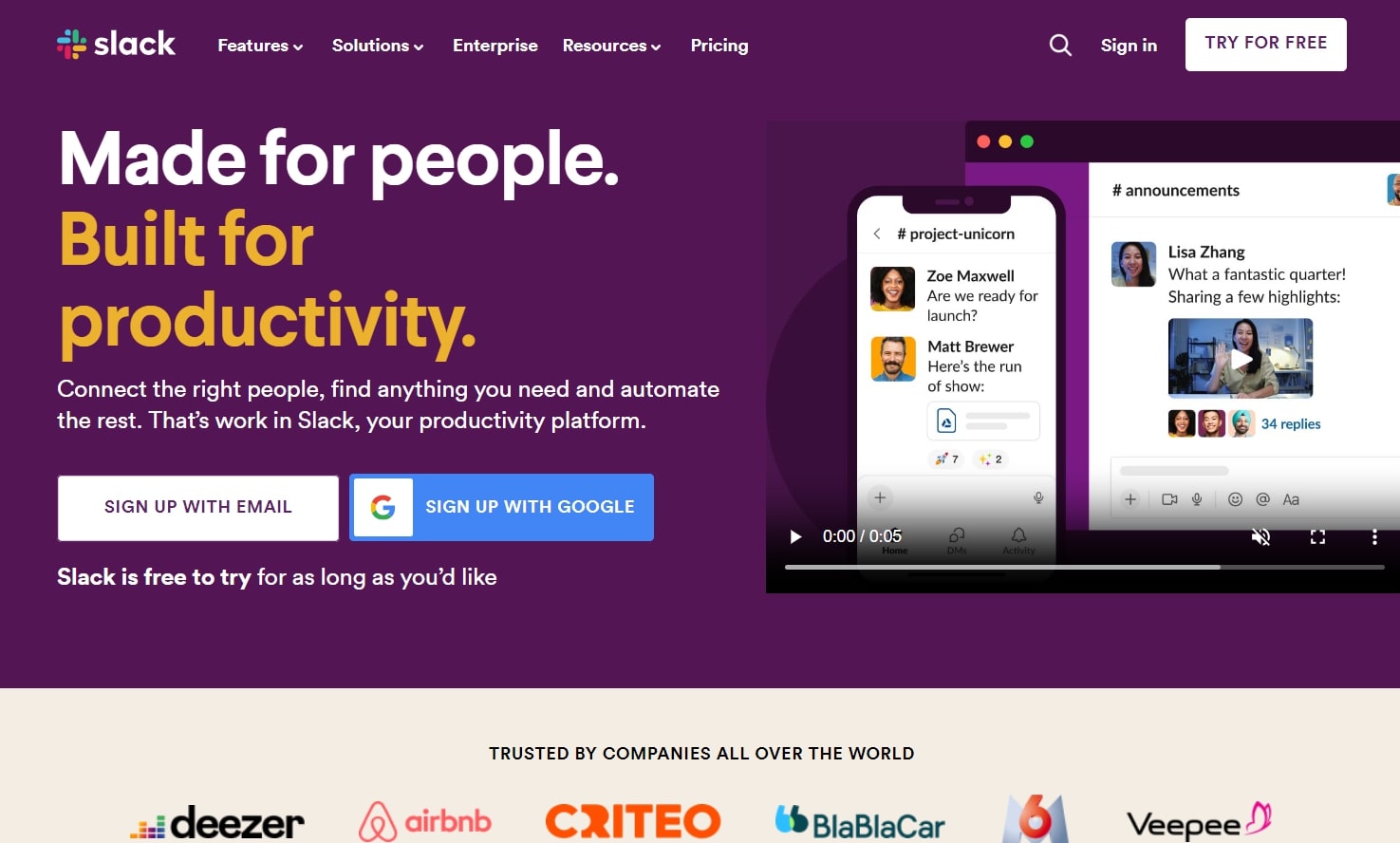
9. A/B Test Signup Flow Enhancement
- A – Use just a “Start Free Trial” button.
- B – Use an email input field accompanied by a “Start Free Trial” button.
Objective: Determine which signup prompt, a standalone button vs. an email input with a button, results in a higher number of signups and user engagement.
Hypothesis: Providing an email input field along with the “Start Free Trial” button will streamline the signup process and lead to a higher conversion rate than just the button alone.
Metrics to track: Number of users initiating and completing the signup process.
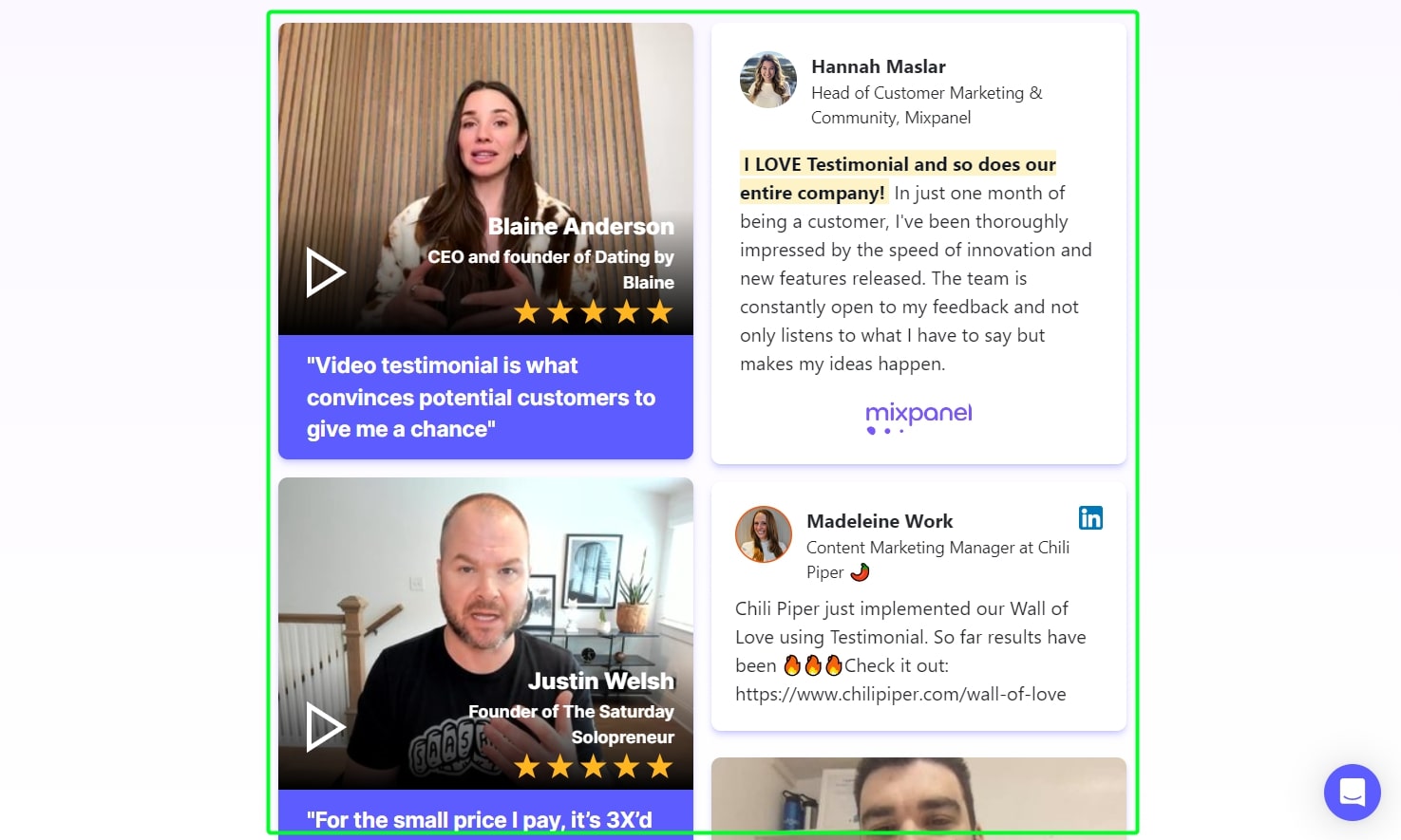
10. A/B Test Wall of Love
- A – Display selected customer testimonials in a traditional format.
- B – Create a “Wall of Love” showcasing various customer praises and feedback.
Objective: Determine which display method, traditional testimonials vs. “Wall of Love”, results in higher trust and engagement from visitors on the website.
Hypothesis: The “Wall of Love” will more effectively showcase customer satisfaction and lead to greater trust and engagement compared to traditional testimonials.
Metrics to track: Number of users engaging with the primary CTA after viewing the testimonials section (e.g., “Read More Reviews”, “Join our Community”, or “Start with Us Today”).
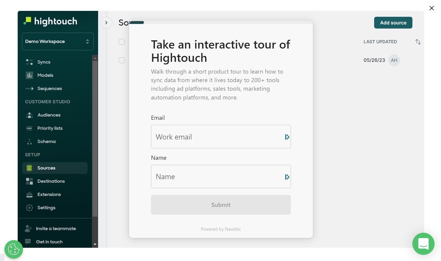
11. A/B Test Live Demo Offer Strategy
- A – Promote a self-guided demo.
- B – Offer a personalized demo with a sales rep.
Objective: Determine which demo offer, self-guided vs. personalized with a sales rep, results in a higher conversion rate to paid customers.
Hypothesis: Offering a personalized demo with a sales rep will lead to a higher conversion rate to paid customers than the self-guided demo.
Metrics to track: Number of users converting to paid customers after experiencing each respective demo type.
12. A/B Test Displaying G2 Badges
- A – Do not display G2 badges on the website.
- B – Display G2 badges prominently on the website.
Objective: Determine whether showcasing G2 badges on the website influences visitor trust and leads to higher engagement and conversion rates.
Hypothesis: Displaying G2 badges will enhance website credibility and result in a higher engagement and conversion rate compared to not displaying them.
Metrics to track: Number of users engaging with the primary CTA on the website (e.g., “Start free trial”, “Learn More”, or “Book a demo”).
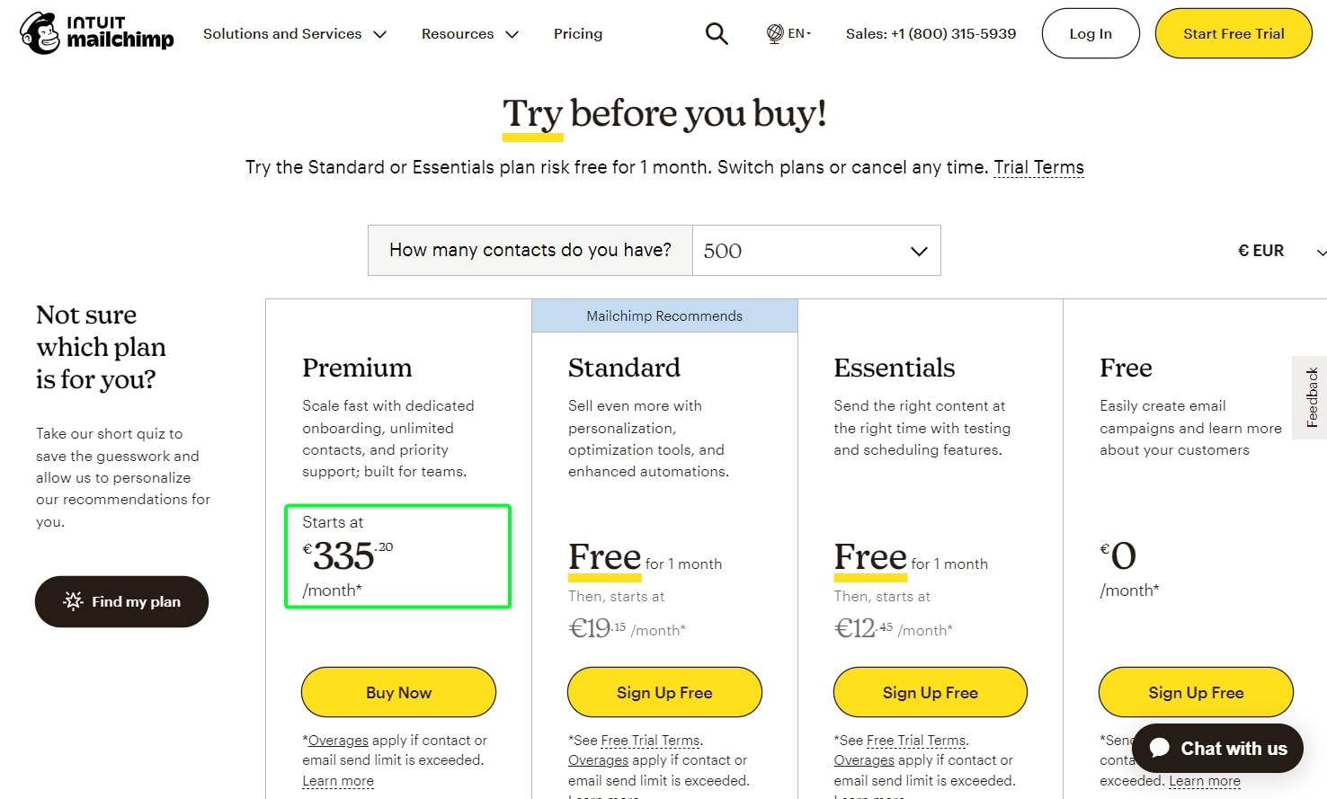
13. A/B Test Pricing Page Display
- A – Display the standard pricing order (usually lower to higher).
- B – Display a higher price first.
Objective: Determine which pricing display order, standard vs. higher price first, leads to a more effective conversion rate on the pricing page.
Hypothesis: Displaying a higher price first will create a price anchoring effect, making subsequent lower prices seem more attractive and leading to a higher conversion rate.
Metrics to track: Number of users selecting a pricing plan after viewing the pricing page.
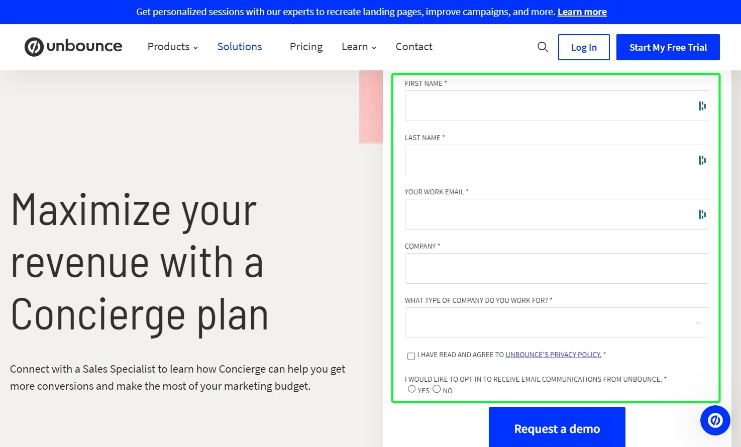
14. A/B Test Form Layout Strategy
- A – Use a double-column form layout.
- B – Use a single-column form layout.
Objective: Determine which form layout, double-column vs. single-column, provides a smoother user experience and leads to a higher form completion rate.
Hypothesis: The single-column form layout will be more user-friendly, leading to a higher form completion rate than the double-column layout.
Metrics to track: Percentage of users completing the form in each respective layout.
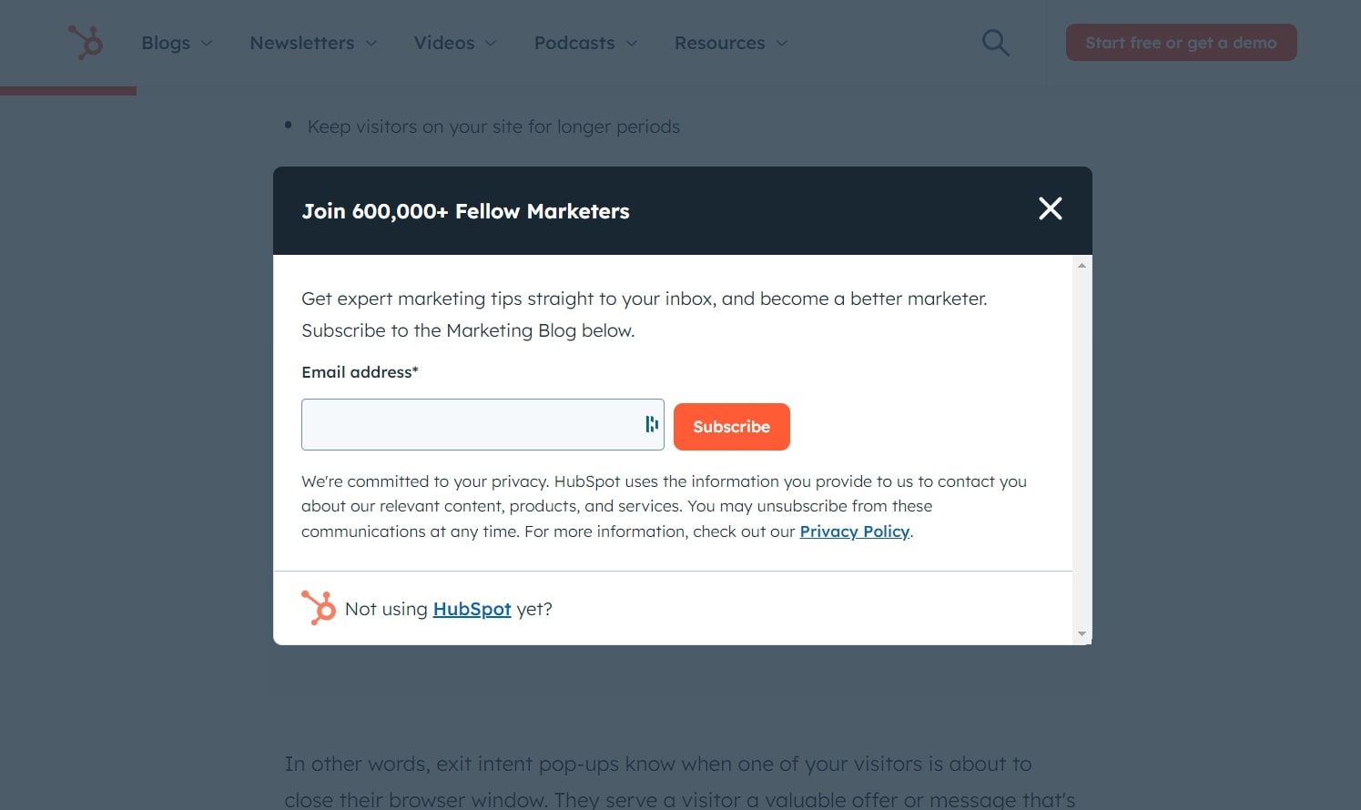
15. A/B Test Exit Intent Strategy
- A – No exit pop-up displayed.
- B – Display an exit pop-up when a visitor goes to close the page.
Objective: Determine whether displaying an exit pop-up effectively retains or re-engages visitors as they intend to leave the page.
Hypothesis: Presenting an exit pop-up will re-engage a significant portion of visitors and lead to a reduced bounce rate or increased conversion actions compared to not displaying a pop-up.
Metrics to track: Number of users who engage with the exit pop-up’s CTA (e.g., “Stay and Get 10% Off”, “Did you forget something?”, or “Download our Guide”).
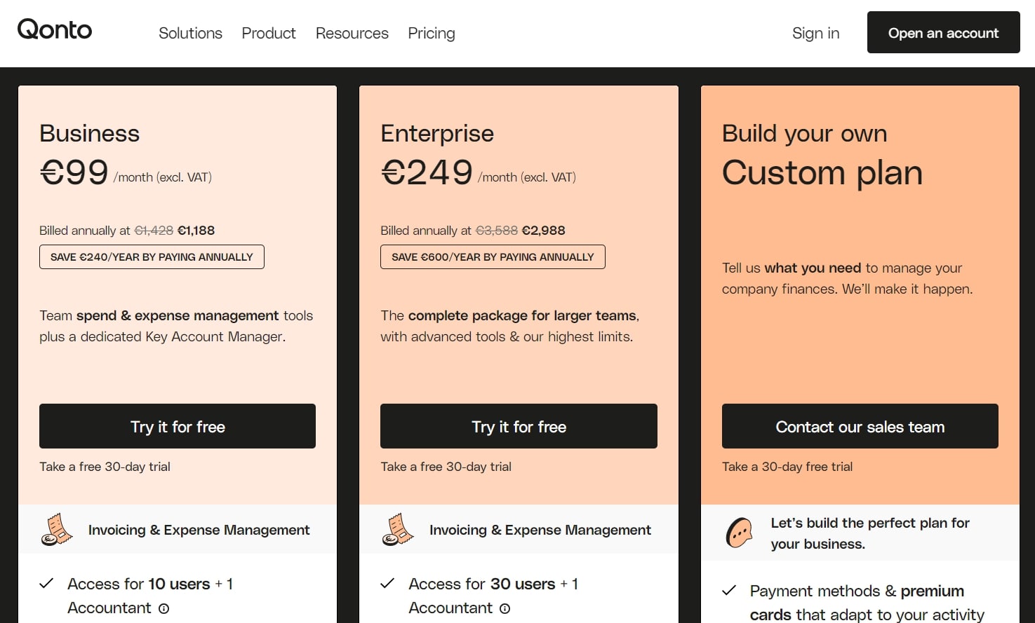
16. A/B Test Pricing Plan Structure
- A – Current number of pricing plans available.
- B – Limit the number of pricing plans to no more than 3.
Objective: Determine whether simplifying the pricing structure to a maximum of 3 plans leads to better clarity for potential customers and results in higher conversions.
Hypothesis: Reducing the number of pricing plans to no more than 3 will make the decision process easier for potential customers, leading to a higher conversion rate.
Metrics to track: Number of signups or purchases for each respective pricing structure.
17. A/B Test Form Field Reduction
- A – Current form with the existing number of fields.
- B – Form with a decreased number of fields.
Objective: Determine whether reducing the number of fields in a form increases form completion rates and user engagement.
Hypothesis: Decreasing the number of fields in the form will lead to a higher completion rate due to a more user-friendly experience.
Metrics to track: Number of completed forms by users for each version.
18. A/B Test User Social Proof Display
- A – Do not show the number of active users or companies.
- B – Display the number of active users or companies using the software.
Objective: Determine if showcasing the number of active users or companies using the software increases trust and leads to better conversion rates on the website.
Hypothesis: Displaying the number of active users or companies will enhance credibility and result in a higher conversion rate compared to not showing this information.
Metrics to track: Number of users engaging with the primary CTA on the webpage (e.g., “Start free trial”, “Learn More”, or “Book a demo”).
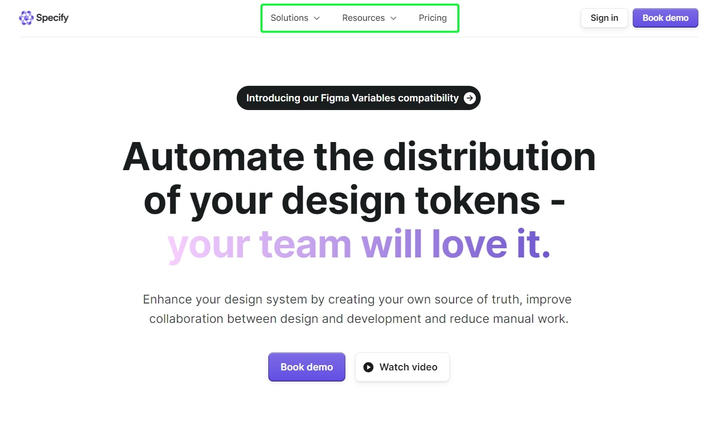
19. A/B Test Navigation Menu Structure
- A – Standard navigation menu.
- B – Reduced number of items in the navigation menu.
Objective: Determine which navigation menu structure, standard vs. reduced items, offers a better user experience and leads to increased user engagement and conversion.
Hypothesis: A reduced number of items in the navigation menu will lead to clearer user pathways and result in a higher engagement and conversion rate compared to the standard navigation menu.
Metrics to track: Number of users engaging with the primary CTA on the website (e.g., “Start free trial”, “Learn More”, or “Book a demo”). Additionally, tracking page views and time spent on key pages can provide insights into user navigation behavior.
20. A/B Test Copy Readability
- A – Use the current copy version.
- B – Use a copy version with improved readability.
Objective: Determine which copy version, current vs. improved readability, enhances user engagement and comprehension, leading to better conversion rates.
Hypothesis: The copy with improved readability will connect more effectively with visitors and result in higher engagement and conversion than the current copy.
Metrics to track: Time spent on the page, bounce rate, and number of clicks on primary CTAs.
21. A/B Test CTA Strategy
- A – Use a single, primary CTA on the page.
- B – Display multiple CTAs on the page.
Objective: Determine which CTA strategy, single vs. multiple, results in higher engagement and conversion rates for visitors on the webpage.
Hypothesis: A single, primary CTA will lead to clearer user direction and result in a higher conversion rate compared to multiple CTAs.
Metrics to track: Number of users clicking on the primary CTA or any of the CTAs presented on the page.

22. A/B Test CTA Phrasing
- A – Use the CTA “Start free trial”.
- B – Use the CTA “Book a demo”.
Objective: Determine which CTA phrasing, “Start free trial” vs. “Book a demo”, results in higher engagement and conversion rates from website visitors.
Hypothesis: The “Start free trial” CTA will resonate more with visitors and lead to a higher conversion rate than the “Book a demo” CTA.
Metrics to track: Number of users clicking on the respective CTA button.
23. A/B Test Headline Length
- A – Use a short, concise headline.
- B – Use a longer, more descriptive headline.
Objective: Determine which headline length, concise vs. descriptive, resonates better with visitors and leads to higher engagement and conversion rates on the website.
Hypothesis: The concise headline will capture visitors’ attention more effectively and result in a higher conversion rate than the longer descriptive headline.
Metrics to track: Number of users engaging with the primary CTA near or associated with the headline (e.g., “Start free trial”, “Learn More”, or “Book a demo”).
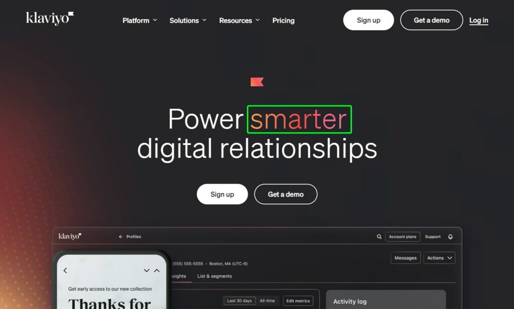
24. A/B Test Headline Highlighting Strategy
- A – Use a uniform color for the entire headline.
- B – Highlight a specific word in the headline with a different color.
Objective: Determine whether highlighting a specific word in the headline with a different color increases engagement and conversion rates compared to a uniformly colored headline.
Hypothesis: Highlighting a specific word in the headline will draw more attention and lead to higher engagement and conversion rates than a headline with uniform color.
Metrics to track: Number of users engaging with the primary CTA following the headline (e.g., “Start free trial”, “Learn More”, or “Book a demo”).
Conclusion
With the 24 testing ideas shared, you’re equipped to tap into the benefits of informed decision-making.
It’s not always about big shifts; often, it’s the subtle changes that connect most with your users.
Dive in, test with intention, and watch your SaaS journey soar.